Has anyone noticed the new MLB Scoreboard? It’s impressive when you take the time to study how much information is packed into a relatively small amount of real estate.
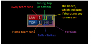
 Take a look but I think these are all the data points packed nicely into the scoreboard:
- Score
- Runners on base
- Pitch count
- Number of outs
- Inning
- Top of the inning
- Home team
Beautiful…How many products have you used that have lots of good data, but the user interface is horrible and it just kills the utility? A poorly designed product can sabotage the sales and marketing effort quickly, so it’s critical to get the packaging right.
Trust me, there are always some power users that will learn the product but, the masses are short on patience and can kill your product quickly if they get frustrated trying to navigate around.
I need to have a call with this designer…
Brick
Recent Comments